|
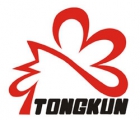
corporate identity: < FONT face = Arial> logo design and the combination of letters, is an abstract pattern, a comb made of the letter is "Tong Kun," the alphabet, simple and clear. crest logo design to the main body, on the one hand and embraced our product brands, products, trademarks and corporate identity has coherence; the other hand, comb like a crown in general, a symbol of status and power, which the Group's position in the chemical fiber industry is consistent, rooster crow metaphor for the sun rising, new day begins, which identified red and black color combination gives a strong visual impact, with strong recognition effect, while red and black with a steady look, cleverly designed so that the whole design has yet lively. corporate mission: business goals: core values: |
| About Cardofcom|Add to Favorites|Register Cardofcom.net|Proposed Feedback|Contact us |
| Cardofcom.net---Card of com at net |
| 版权所有 沧州双一商贸有限公司 冀ICP备16002221号 |


